10 Design Errors to Avoid When Creating Business Cards

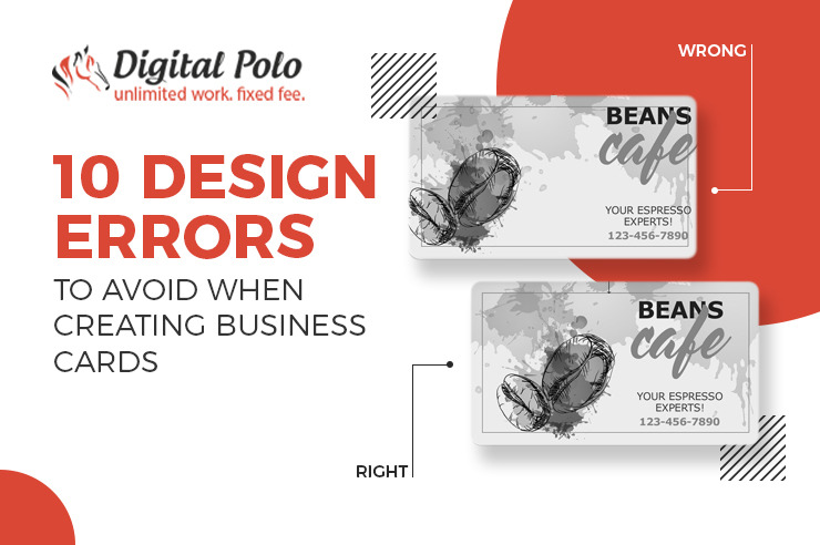
Business cards have been used as a marketing strategy to help customers recall important company information. However, the procedures of creating business cards have changed as a result of technological and aesthetic advancements. We frequently ignore this aspect and so pass up an opportunity to make a positive first impression. For businesses, especially those that are just getting started, a badly designed card may be fatal. Are you making any of these design mistakes with your business cards? Let’s look at 10 most typical design errors for business cards.
Business cards with small fonts:
Most of us don’t have 20/20 eyesight. To adjust our eyesight, we use glasses or contacts. Make sure your font size is readable on a business card that is 3.5″ x 2″ in size. It’s best to practice printing out a sample page using your font size in its true size first. Check to see if your writing is readable by asking your friends and co-workers. If required, modify.
Poor font selection:
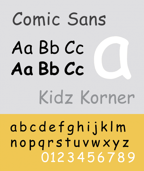
Most people generally think of Comic Sans when they consider examples of bad font selections. The situation truly reflects the typeface. For instance, using Comic Sans at a hospital would confuse, while doing so in a day-care facility is often OK. Here is some sound guidance. Run with it, using no more than two typefaces. Avoid ornate typefaces and ones that imitate handwriting as much as you can because they are difficult to read in a tiny space.
The shape of the paper:
This one is rather debatable because the majority of people recommend using distinctive business cards to stand out. In reality, best business cards design that flout expectations and norms are a common theme in online collections that become popular.
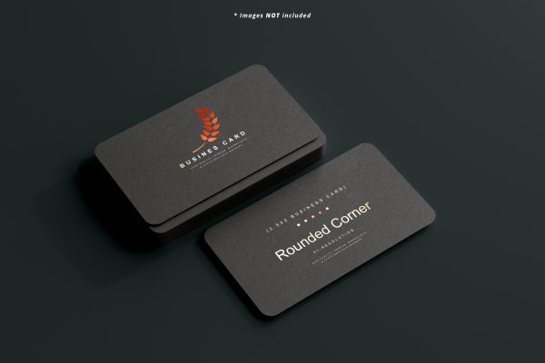
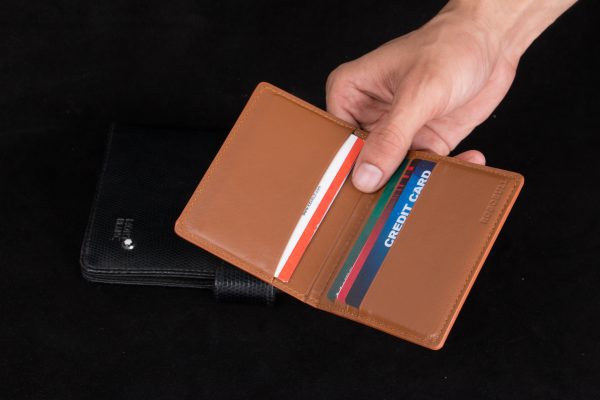
However, in reality, business cards won’t fit easily in wallets, handbags, and yes, Rolodexes since they are bulky and awkwardly shaped. Sure, your receivers could want to show off your quirky card to others, but eventually, they’d have to store it until needed to get in touch with you. The standard 3.5″ x 2″ card works in this situation. Consider utilizing a folded card if you’d like to have a larger card. Finally, think about choosing shapes that will fit in the recipient’s wallet if you still want to have a card that is distinctively formed.
The type of paper:
Essentially, your business card serves as your initial impression. It will reflect poorly on your company as a whole if your business cards graphic design, brand design is produced on paper that is subpar. We don’t want that.
Ask your printing company what types of paper are available when producing a set of business cards. Although thicker, higher-quality cardboard for business cards often costs more, it is unquestionably an investment that will pay off for you.
The contrast in color:
Another problem with readability, except this time it involves color. Some individuals might find it difficult to see your font if the color is too similar to the background color. Especially true for those who are color blind. So, contrast needs to be taken into account. Generally speaking, aim to build your business cards graphic design, brand design on a limited color scheme that matches the colors of your company. To make things easier to read, try using black writing on a light backdrop.
Not Providing adequate details:
These days, minimalism appears to be fashionable, and for good reason. Serif lettering on a subdued off-white background really looks attractive and sophisticated. No matter how well designed your minimalist business card is, if it doesn’t have a way to reach you, it’s useless.
Providing excessive details:
Your business card should contain as much information as possible about your organization. But because your business card is so little, you have a minimal amount of room. If you try to get too much in, you will have to lower the font size, which will make it harder to read, or you run the danger of cluttering your card and having a lousy layout design.
Think about the details that are crucial to your type of organisation. Phone numbers, email addresses, and name and job are usually always required. Your websites and social media profiles may need to be included, depending on your line of work. If you’re a graphic designer, for instance, you might want to include the URL to your Behance profile on the card so the recipient can view your portfolio.
Disorganized Branding:
Brand image is significant in best business card design. Your recipient will become confused if the design of your business card, including the fonts and visuals, does not match the aesthetics of your logo. Use the same typefaces and colour scheme as your website and other marketing materials as much as you can. In this manner, people will recognise you right away.
Insufficient white space:
The area around your text or visuals is known as white space. It is also crucial to the design of your business card. To add attention and emphasis to what you’ve written, there should ideally be a balance between your text or visuals (positive space) and the area around them (white space). You can leave some room on your card for blank space. Do not feel obligated to include additional components or information on your card. After all, making your contact information readily available is one of the key goals of the business card. Utilizing white space effectively facilitates this.
Overused selling proposition:
After a few days, you don’t want the receiver to glance at your card and not recognise you. Yes, you may make your card stand out by giving it an odd form or a vibrant, striking design. However, the fact remains that you exchanged cards with your potential customer for professional reasons. What you actually do, is what makes you relevant to the recipient. Your brand promise, the one special reason the recipient should do business with you, should be included


